One City Page Template,
Two Different Jobs
One redesign fit
most cities, not all of them.
Partway through the city pages redesign, my PM flagged something the new design hadn't solved: it was strong on orientation, but wasn't helping travelers make progress, especially in smaller cities. The page had been built through a marketing lens organized around inventory, rather than a demand-side lens organized around what travelers were actually trying to accomplish.
He brought it to me as an area worth exploring, not a fully scoped problem. I went back to our JTBD research and the product portfolio itself to find out whether the pattern was real, then built out what a fix would actually look like on two real cities.
A demand-side gap the redesign hadn't closed.
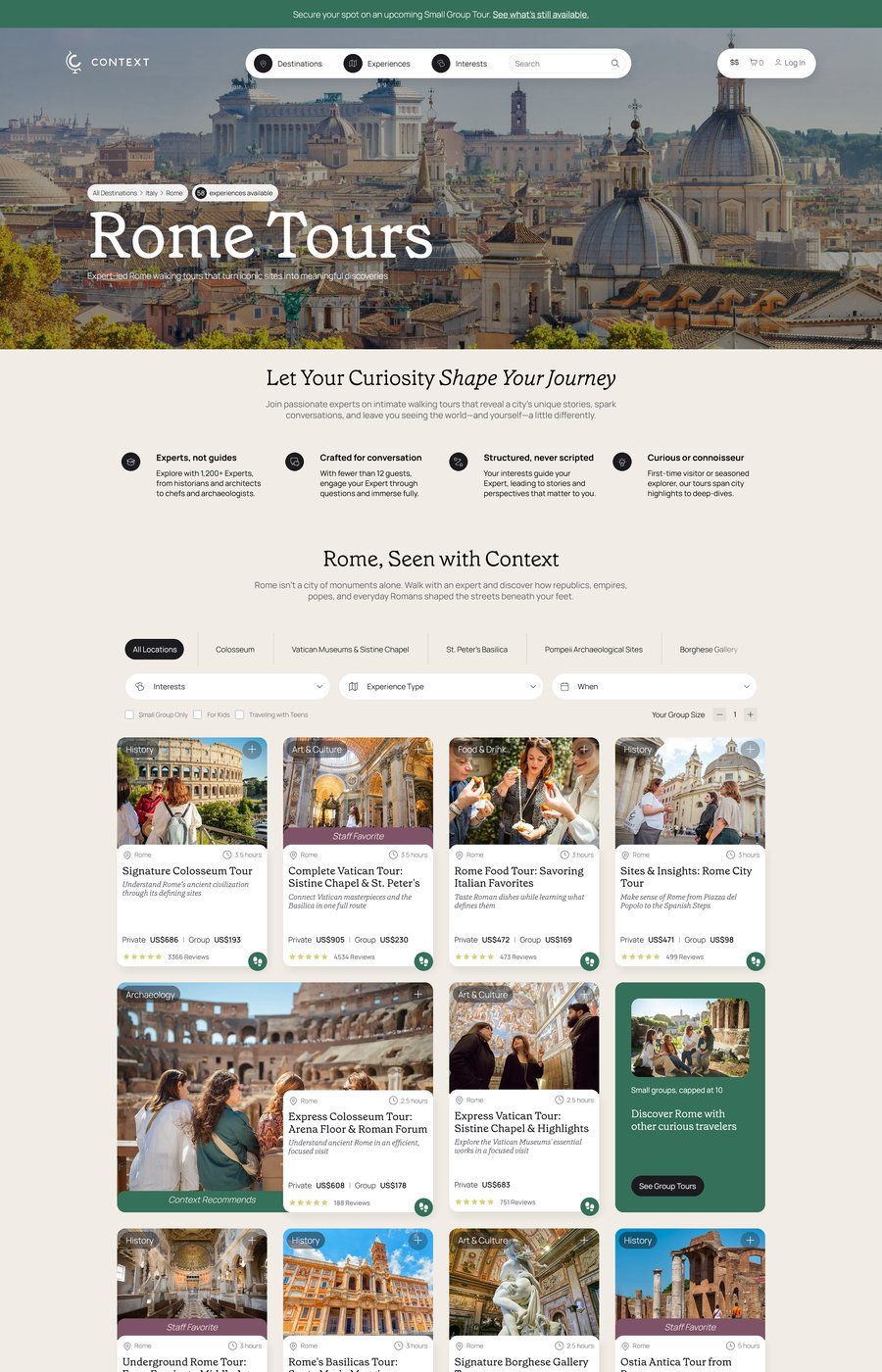
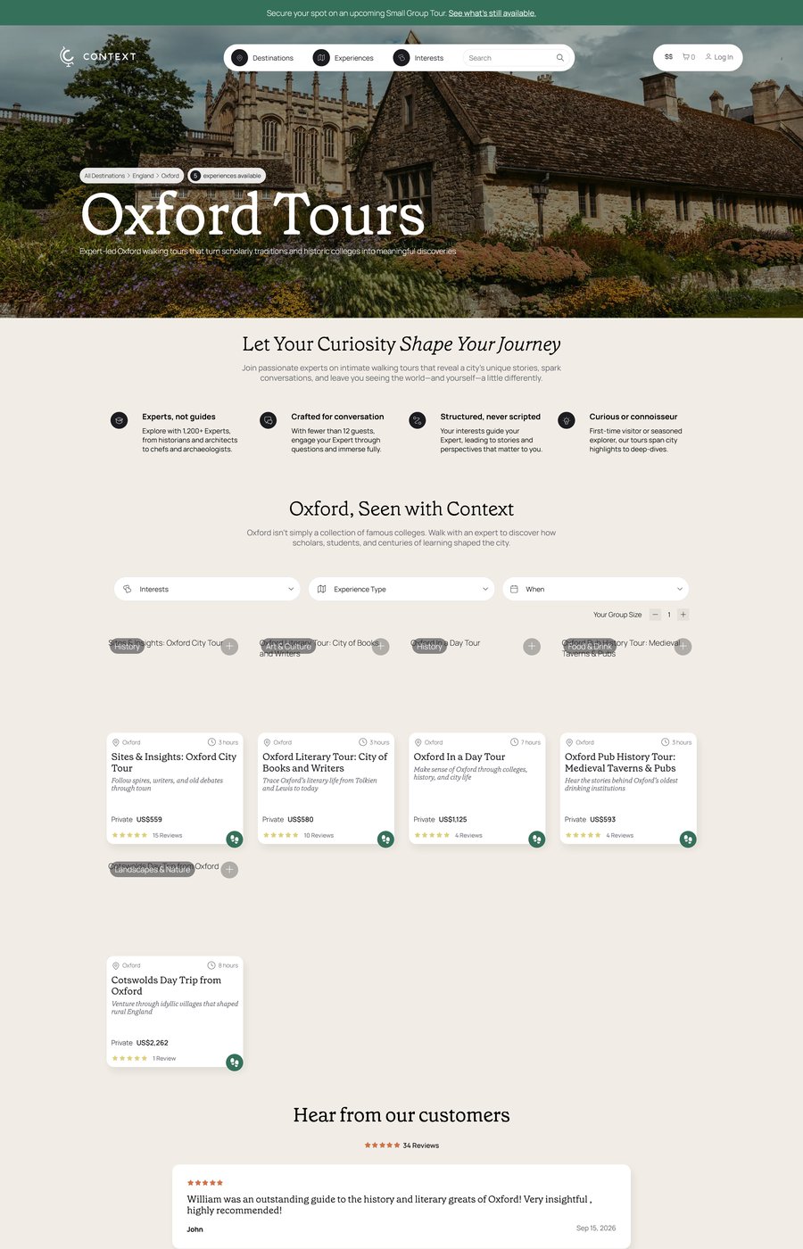
Small cities still felt like an afterthought even after the redesign shipped: a handful of products dropped into the same template built for destinations with dozens of experiences to sort through. The page format didn't distinguish between a traveler in Rome navigating 50+ options and a traveler in Oxford choosing between three.
The harder problem sat one level up: the assumption that one traveler decision pattern applied everywhere. Fixing it meant going back to what travelers actually do differently in a dense destination versus a compact one, not just re-laying out a template.
"A dense city and a small one aren't the same traveler with fewer options. They're two different jobs wearing the same page template."
One Template, Every City
- Same page structure regardless of product count
- Large cities: dozens of products, no way to sort by interest depth
- Small cities: 3-4 products, dressed up in a template built for 50
- No signal to travelers about how much there is to explore
Template That Adapts by Job
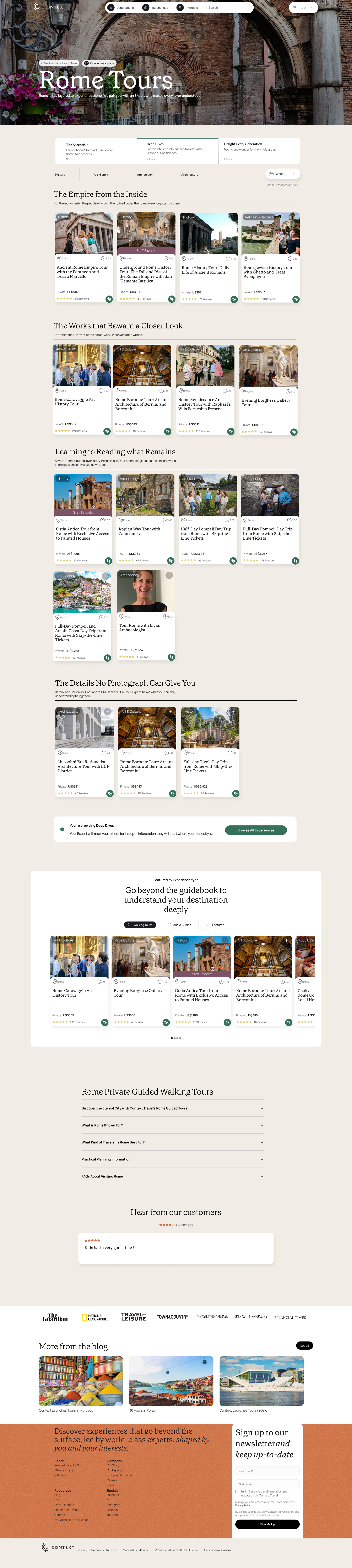
- Large cities: job-based entry tabs (Essentials, Deep Dives, Delight Every Generation) above full location + interest filtering
- Small cities: curated cards only, no filtering overhead
- Same visual language and component system across both
- Framed for stakeholders as identity, not inventory: "experience everything" vs. "trust our experts"
Reading the portfolio the way travelers experience it.
I went back to our JTBD client interviews and the stories travelers told about bigger versus smaller cities, then cross-referenced that against our product portfolio by city size. The pattern held: large cities carry 40 to 60 products spanning first-time orientation to hyper-specific niche interests, because travelers there are trying to experience everything a dense destination offers. Small cities carry only 3 to 4 products, typically one general introduction plus a couple of curated cultural tours, because travelers there are trying to make fast progress toward the handful of experiences that actually matter.
That's a demand-side distinction, not a content gap to fill. Rome needs better filtering, not more curation. Oxford needs the confidence signal that three curated options are the right three, not more products dressed up as an incomplete catalog.
The gap only became visible after the redesign shipped
The problem wasn't obvious ahead of the main redesign. It took a completed, live design to see exactly where it stopped working for smaller destinations.
Filtering serves distinct jobs, not just product count
A large city isn't one traveler with more options, it's several distinct travelers with different jobs: first-time orientation, deep cultural interest, food-focused exploration, and more, all arriving at the same page. Filtering controls aren't there to manage volume; they let each traveler identify their own circumstances and sort directly to the experience that matches their job, which is also why a small city with one shared job doesn't need them.
Four decisions that
turned a hunch into a pitch.
The choices behind taking a PM's observation from a flagged gap to a stakeholder-ready concept.
Verify the pattern in the data before designing anything
Before sketching a single screen, I cross-referenced JTBD interview themes against actual product counts by city size. The 40-60 vs. 3-4 split confirmed the gap was structural, not anecdotal, which is what made it worth building a real proposal around.
Mock up the small-city case first, on a real destination
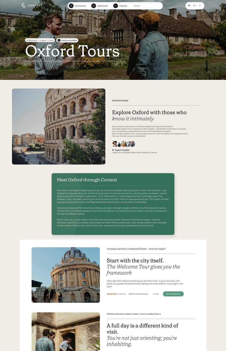
Oxford became the proof case for the small-city job: curated cards, no location sub-filtering, same visual language as the main site.
Mock up the large-city case on the same shared template
Rome got the inverse: job-based entry points, Essentials, Deep Dives, Delight Every Generation, plus full location and interest filtering across dozens of products, using the identical header, card, and typography system as Oxford. Where Oxford's travelers share one job, Rome's are several different travelers at once, so the mockup gives each one a direct path to their own job instead of one undifferentiated list.
Frame the pitch in identity language, not inventory language
Rather than presenting it as a filtering feature, my PM and I framed it as two different brand promises: large cities as "experience everything, our way," small cities as "trust our experts to tell you what matters." That framing is what made the underlying data-driven case legible to stakeholders.
One template,
configured by job.
The proposal is one shared component system, not two designs, with two configurations switched on by how many products a destination actually carries. Nothing about the header, typography, or card component changes between Oxford and Rome; only the entry layer above it does, job-based tabs and full filtering for Rome, a single curated list for Oxford.
That's what makes it a framework-level pitch rather than a one-off fix: any new city page would inherit the right configuration automatically, instead of every destination needing its own bespoke layout decision.
Shared Visual Language
Same header, typography, and card component across every city page, regardless of product count. Only the filtering and card count change between configurations.
Job-Based Entry Points
Large cities add a tab layer, Essentials, Deep Dives, Delight Every Generation, above the catalog, so each traveler segment lands directly on their own job instead of filtering down from one undifferentiated list.
This is a pitch/concept, not a shipped change. Presented honestly as a framework-level recommendation still waiting for the right window, not a completed rollout. Re-pitching depends on the current city page redesign having enough time in market to prove or disprove itself first.
What I'd do differently.
The idea landed on people, not on timing. Bringing a framework-level reframe to stakeholders right after we'd just shipped a redesign meant the ask was competing with a design that hadn't had time to prove itself yet. A stronger pitch would have named that sequencing risk upfront instead of after the room reacted to it.
If I did this again, I'd attach the mockups to the very first conversation about the idea, not build them after. Having Oxford and Rome to point to earlier might have shifted the conversation from "interesting theory" to "here's what it looks like" sooner.
"The research held up. The stakeholders agreed the jobs were different. What I underestimated was that being right about the framework doesn't matter if the room just watched a different redesign ship."
Michaela Hoffman, Principal UX/UI Designer