Redesigning Availability,
Clear at a Glance
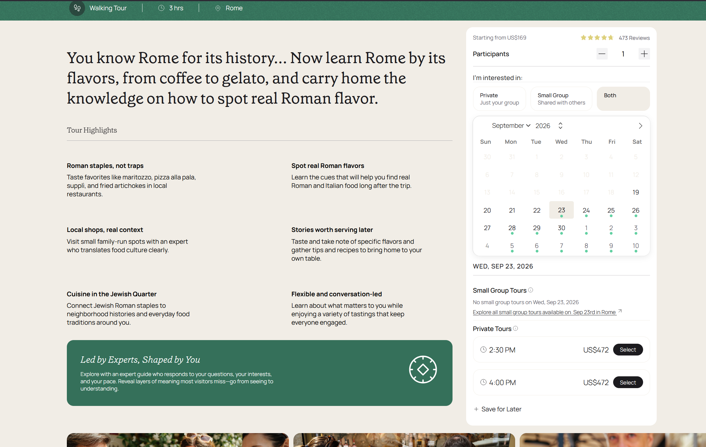
A calendar that couldn't say
which tour was actually open.
Small-group tours run in far fewer numbers than private tours, so for price-sensitive travelers, and the travel advisors booking on their behalf, finding a date where small-group was actually available mattered a lot. The old calendar's single availability dot didn't say which tour type it meant: a dot could mean small-group and private were both open, or just private. The only way to find out was to click into each date, one at a time, and read what loaded underneath.
I led the redesign and frontend implementation of the booker calendar experience, applying jobs-to-be-done framing to separate the two tour types instead of collapsing them into one ambiguous signal.
One dot, two meanings.
Small-group tours are scarcer than private ones, so a traveler, or an advisor booking on a client's behalf, who specifically wanted small-group had to hunt for it. The calendar's day-level indicator didn't distinguish between "small-group is open" and "only private is open": both looked identical, so the only way to know was to click into the date and see what actually loaded.
Mapping how visitors actually moved through the calendar (via the city breadcrumb, the browser back button, and a corrected date) surfaced the same root issue from another angle: three unrelated navigation paths all landed on the same unhandled state when there was truly nothing bookable that day, with no indication of why or where to go next.
"A dot on the calendar told you something was bookable. It didn't tell you what."
One Ambiguous Dot
- A single dot meant "something" was bookable: small-group, private, or both
- No way to tell tour type without clicking into the date
- Price-sensitive travelers and advisors had to check dates one by one
- Every return path to the calendar hit the same unlabeled dead end when nothing was open
Type-Specific Availability
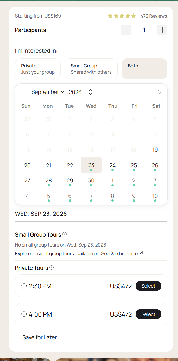
- Toggle to Private, Small Group, or Both
- Selected type's availability shown first, other type follows underneath
- No more clicking each date to find out what's actually bookable
- Same visual language, no new component system introduced

Framing availability
around the traveler's job.
The redesign started from a JTBD lens: a traveler comparing small-group and private isn't browsing an inventory system, they're trying to answer "can I get the tour type I actually want, on a date that works." The old calendar could only answer "something is bookable," not which type.
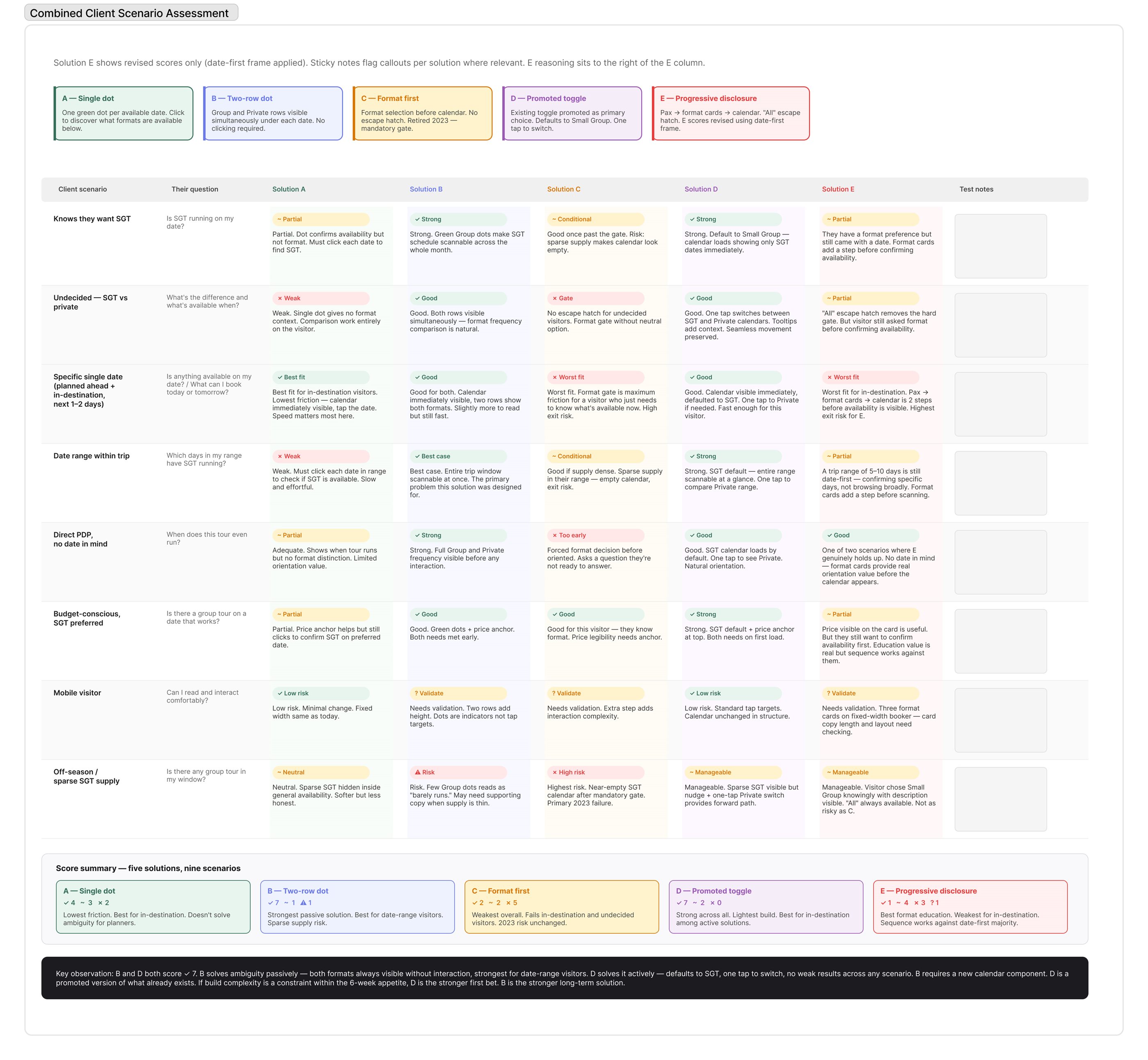
Before deciding on a fix, I scored five candidate solutions, ranging from a minimal single-availability-dot indicator through a full progressive-disclosure flow, against nine distinct client scenarios (in-destination visitors, undecided-format visitors, sparse-supply months, mobile, and more). A type-aware version of the simplest option, a toggle plus a day-level indicator scoped to the selected type, scored best across the board.
An ambiguous indicator is worse than no indicator
A dot that could mean two different things trained travelers to distrust it and click through anyway, defeating the point of showing availability on the calendar at all.
A dead end is a design failure, not an edge case
Three unrelated visitor behaviors all converged on the identical unhandled state: clicking a breadcrumb, hitting browser back, correcting a wrong default date. That convergence was the signal that the dead end itself was the bug, not any one navigation path into it.
Three decisions,
one clearer calendar.
The choices behind making two tour types legible on one calendar, without adding a second one.
Prioritize the selected tour type instead of blending both into one dot
A toggle lets travelers choose Private, Small Group, or Both up front. Selecting a specific type scopes the calendar's day-level dots to that type only, so a small-group-only traveler never has to wonder what an ambiguous dot meant. When both types are available on a day, the selected type surfaces first with the other type shown right underneath, so switching is a glance away instead of a re-click through the calendar.
Pick the build-light option as the first bet, even though it scored lower long-term
Two solutions tied at the top of the nine-scenario comparison: the toggle-plus-indicator approach, and a two-row calendar view that would have required a new component. Within a 6-week appetite, the toggle shipped first. The heavier, stronger long-term option stayed on the list for later rather than blowing the scope.
Build the frontend myself to keep the JTBD framing intact through implementation
Design-to-development handoff is where JTBD framing often gets lost to backend convenience. Implementing it directly meant the shipped experience matched the designed one.
One toggle,
no new components.
The redesign didn't introduce a new component system so much as it re-sequenced an existing one around tour type, built in SCSS to align with the broader design system. Internal reception was strong; team members independently noted it looked significantly more polished than the legacy version.
Scoring the heavier two-row calendar option alongside the lighter toggle, and being explicit about why the lighter one shipped first, kept the door open to revisit the stronger long-term layout later without it reading as a compromise nobody chose on purpose.
This shipped as a usability fix to the calendar's day-level signal, not as a revenue-tracked feature. The site's alternative-date booking behavior, a related but separate feature, is the one measured in Revenue Recovery Analysis.
What I'd carry
into the next one.
Ambiguous indicators are an easy trap: a dot that technically "shows availability" doesn't actually answer the traveler's real question. Naming the specific job, small-group availability, not just "something is bookable", earlier would have made the ambiguity obvious sooner.
I'd also build in a lightweight post-launch check next time, even a qualitative one, rather than assuming the toggle was working as intended just because it shipped and looked right.
"The calendar wasn't broken. It just couldn't tell you what you actually wanted to know. Once I named that as the real problem, the fix was more about subtraction, one ambiguous dot, than addition."
Michaela Hoffman