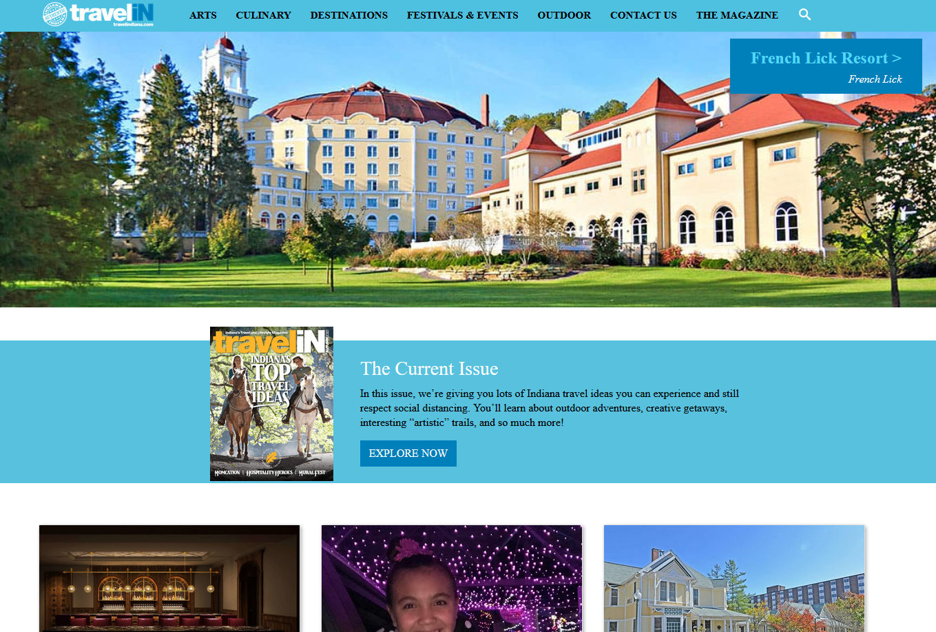
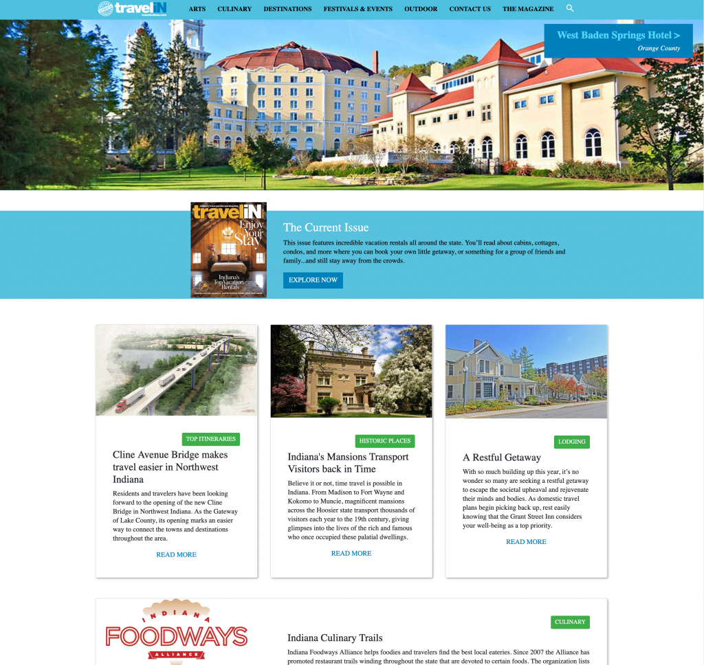
When Travel Indiana Approached me the site looked like this first image. At the widescreen desktop size everything looked way it does in the screenshot.
It was time to give the site’s UI elements a modern fresh feel.
The theme they had chosen for their WordPress site was not handling responsive sizes very well. The banner image at the top did not allow them to overlay important promotional text which caused it to often get pushed off screen based on the view size.
The magazine was promoted in the last block on the page and didn’t really stand out or show off that this did have a physical magazine they created content with.
We worked together to determine the goals and priority for the homepage deciding that images would still play a main role in the top of the screen but would remove the image text to a floating block that would stay in place no matter the screen size.
We also made the magazine more prominent in the flow of the content. We then continued with a more modern design to their 3 across grid for the additional articles on the website.
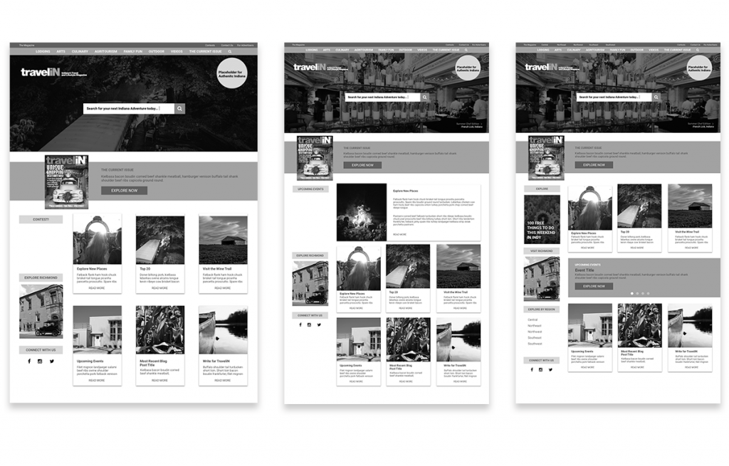
For this project we knew we didn’t want to get too far from the existing layout but we wanted to bring it a fresh look and feel so we focused on small variations in the layout to create better and more advertising opportunities on the homepage.
We knew we wanted a large banner image, a section for the magazine, a grid and the sidebar. But we weren’t sure how we wanted to break down the grid or break it up with longer form content for larger ad space. Because of this we were able to jump right into mock-ups since the rough layout was already determined from what was existing.
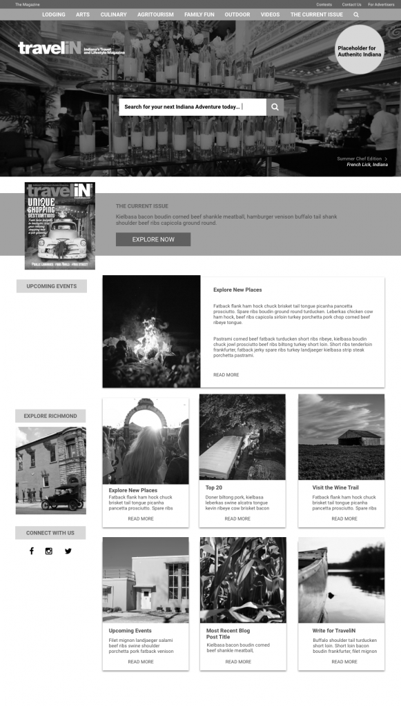
Before moving into how we would apply the branding colors to the layout we discussed the layout and element designs in a purely grayscale mockup.
After working through the grey scale exercise we landed on long form content looking similar and being dispersed between the smaller grid cards as the homepage we wanted to develop.
Responsive Mockup Examples
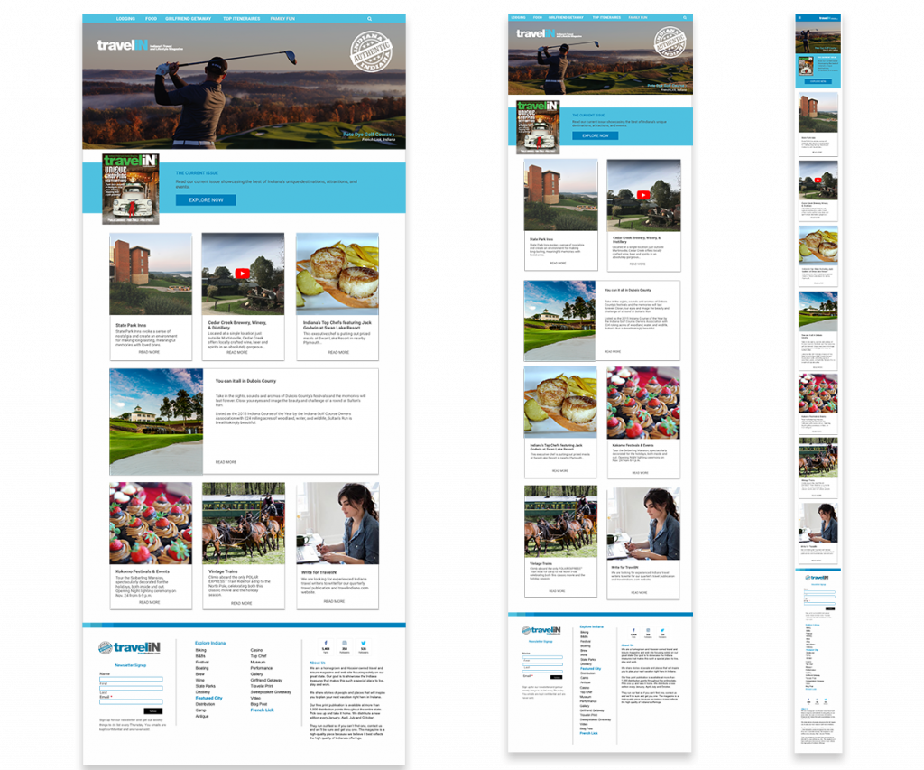
I worked with child themes to create a new homepage that would support TravelIn’s goals. I then built the responsive code to handle the repeating php elements using bootstrap, html, and css.This allowed us to retain the other parts of the site as is and create the beautifully responsive homepage design we could lay over the other code inside WordPress.

